Building a notification center with Svelte stores
You have seen them everywhere. That little bell icon in the upper right corner with unread messages count. Learn how to build one with Svelte stores and Tailwind CSS.
You have seen them everywhere. That little bell icon in the upper right corner with unread messages count. Learn to build one with the help of Svelte stores and Tailwind CSS.
The Setup#
We will use Snowpack and pnpm to create out project, because I find them pretty nice to work with, but you can of course use any bundler and package manager you want.
# create project
$ pnpx create-snowpack-app svelte-notification-center \
  --template @snowpack/app-template-svelte
$ cd svelte-notification-center

# install tailwind css and friends
$ pnpm add -D postcss-cli tailwindcss autoprefixer
$ pnpx tailwindcss init
Setting up Snowpack, PostCSS and Tailwind#
Next, we need to tell Snowpack to process our CSS files. Create postcss.config.js in the root folder of the project.
// postcss.config.js

module.exports = {
  plugins: [
    require('tailwindcss'),
    require('autoprefixer')
  ]
};
Create main.css in the src directory with the following contents.
/* main.css */

@tailwind base;

@tailwind components;

@tailwind utilities;
Last thing we need to do is to add postcss command to snowpack.config.json
{
  "extends": "@snowpack/app-scripts-svelte",
  "scripts": {
    "build:css": "postcss"
  },
  "plugins": []
}
All setup and ready to go!
Creating the layout#
When prototyping an idea I like to work outside in. It helps me to identify the needed data and then write my logic on the shape and flows defined by that data.
<!-- App.svelte -->

<style>
  /* unread message count */
  .badge {
    display: inline-block;
    position: absolute;
    top: 0;
    background-color: #4285f4;
    color: #d7e6fd;
    right: 0;
    border-radius: 9999px;
    font-size: 12px;
    min-width: 18px;
    line-height: 18px;
    min-height: 18px;
    text-align: center;
  }
  /* custom width for message popup */
  .messages {
    min-width: 400px;
  }
</style>

<script>
  // Main stylesheet. Snowpack will inject it in the head tag
  import './main.css';
</script>

<div class="container flex flex-col max-w-4xl min-h-screen mx-auto">
  <!-- top menu -->
  <header
    class="flex items-center justify-between px-5 py-3 text-gray-100 bg-gray-800"
  >
    <h1 class="text-2xl">Hooli</h1>
    <nav class="relative">

      <!-- notification center -->
      <button class="relative p-1">
        <svg
          xmlns="http://www.w3.org/2000/svg"
          width="24"
          height="24"
          viewBox="0 0 24 24"
          fill="none"
          stroke="currentColor"
          stroke-width="2"
          stroke-linecap="round"
          stroke-linejoin="round"
          class="w-6 h-6"
        >
          <path d="M18 8A6 6 0 0 0 6 8c0 7-3 9-3 9h18s-3-2-3-9" />
          <path d="M13.73 21a2 2 0 0 1-3.46 0" />
        </svg>
        <span class="badge">2</span>
      </button>

      <!-- this button will be used for closing the popup later -->
      <button
        tabindex="-1"
        class="fixed inset-0 w-full h-full cursor-default focus:outline-none"
      />

      <div
        class="absolute right-0 p-3 mt-1 text-gray-600 bg-white bg-gray-100 rounded shadow-md messages"
      >
        <ul class="space-y-3">
          <li class="p-3 border rounded">
            <p>Message One</p>
            <div class="mt-1">
              <button class="px-2 text-sm text-blue-200 bg-blue-700 rounded-sm">
                dismiss
              </button>
            </div>
          </li>
          <li class="p-3 border rounded">
            <p>Message Two</p>
            <div class="mt-1">
              <button class="px-2 text-sm text-blue-200 bg-blue-700 rounded-sm">
                dismiss
              </button>
            </div>
          </li>
        </ul>
        <div class="flex justify-end mt-3">
          <button class="px-2 text-sm text-blue-200 bg-blue-700 rounded-sm">
            clear all
          </button>
        </div>

      </div>
    </nav>
  </header>

  <div class="flex-grow px-5 py-3 bg-gray-200">
    <h2>Content</h2>
  </div>

</div>
If you've done everything right you should see something like this.
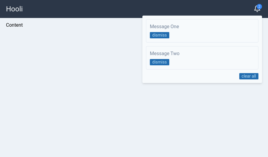
This is the static version. As we go alone we will add dynamic functionality and slowly refactor it.
Extracting message component into separate file#
First thing we will do is to extract our notification center to own file.
Create a src/Messages.svelte file and move the messages part of the file to it.
<!-- Messages.svelte -->

<style>
  /* unread message count */
  .badge {
    display: inline-block;
    position: absolute;
    top: 0;
    background-color: #4285f4;
    color: #d7e6fd;
    right: 0;
    border-radius: 9999px;
    font-size: 12px;
    min-width: 18px;
    line-height: 18px;
    min-height: 18px;
    text-align: center;
  }
  /* custom width for message popup */
  .messages {
    min-width: 400px;
  }
</style>

<!-- notification center -->
<button class="relative p-1">
  <svg
    xmlns="http://www.w3.org/2000/svg"
    width="24"
    height="24"
    viewBox="0 0 24 24"
    fill="none"
    stroke="currentColor"
    stroke-width="2"
    stroke-linecap="round"
    stroke-linejoin="round"
    class="w-6 h-6"
  >
    <path d="M18 8A6 6 0 0 0 6 8c0 7-3 9-3 9h18s-3-2-3-9" />
    <path d="M13.73 21a2 2 0 0 1-3.46 0" />
  </svg>
  <span class="badge">2</span>
</button>

<!-- this button will be used for closing the popup later -->
<button
  tabindex="-1"
  class="fixed inset-0 w-full h-full cursor-default focus:outline-none"
/>

<div class="absolute right-0 p-3 mt-1 text-gray-600 bg-white bg-gray-100 rounded shadow-md messages">
  <ul class="space-y-3">
    <li class="p-3 border rounded">
      <p>Message One</p>
      <div class="mt-1">
        <button class="px-2 text-sm text-blue-200 bg-blue-700 rounded-sm">
          dismiss
        </button>
      </div>
    </li>
    <li class="p-3 border rounded">
      <p>Message Two</p>
      <div class="mt-1">
        <button class="px-2 text-sm text-blue-200 bg-blue-700 rounded-sm">
          dismiss
        </button>
      </div>
    </li>
  </ul>
  <div class="flex justify-end mt-3">
    <button class="px-2 text-sm text-blue-200 bg-blue-700 rounded-sm">
      clear all
    </button>
  </div>

</div>
We can now import it into the App.svelte.
<!-- App.svelte -->

<script>
  // Main stylesheet. Snowpack will inject it in the head tag
  import './main.css';
  import Messages from './Messages.svelte';
</script>

<div class="container flex flex-col max-w-4xl min-h-screen mx-auto">
  <!-- top menu -->
  <header
    class="flex items-center justify-between px-5 py-3 text-gray-100 bg-gray-800"
  >
    <h1 class="text-2xl">Hooli</h1>
    <nav class="relative">
      <Messages />
    </nav>
  </header>

  <div class="flex-grow px-5 py-3 bg-gray-200">
    <h1>Content</h1>
  </div>

</div>
Everything should work as before and we can now concentrate on one file only.
Adding popup functionality#
We will now make our messages popup interactive. It will start in closed state and when you click on the bell button it will appear.
In order to achieve this we need to add a state variable.
<!-- Messages.svelte with style tag omitted -->
<script>
  // open-close state
  let show = false;
</script>

<button class="relative p-1" on:click={() => (show = !show)}>
  <svg
    xmlns="http://www.w3.org/2000/svg"
    width="24"
    height="24"
    viewBox="0 0 24 24"
    fill="none"
    STROke="currentColor"
    stroke-width="2"
    stroke-linecap="round"
    stroke-linejoin="round"
    class="w-6 h-6"
  >
    <path d="M18 8A6 6 0 0 0 6 8c0 7-3 9-3 9h18s-3-2-3-9" />
    <path d="M13.73 21a2 2 0 0 1-3.46 0" />
  </svg>
  <span class="badge">2</span>
</button>

<!-- show only if true -->
{#if show}
  <!-- clicking anywhere on the page will close the popup -->
  <button
    tabindex="-1"
    class="fixed inset-0 w-full h-full cursor-default focus:outline-none"
    on:click|preventDefault={() => (show = false)}
  />

  <div
    class="absolute right-0 p-3 mt-1 text-gray-600 bg-white bg-gray-100 rounded shadow-md messages"
  >
    <ul class="space-y-3">
      <li class="p-3 border rounded">
        <p>Message One</p>
        <div class="mt-1">
          <button class="px-2 text-sm text-blue-200 bg-blue-700 rounded-sm">
            dismiss
          </button>
        </div>
      </li>
      <li class="p-3 border rounded">
        <p>Message Two</p>
        <div class="mt-1">
          <button class="px-2 text-sm text-blue-200 bg-blue-700 rounded-sm">
            dismiss
          </button>
        </div>
      </li>
    </ul>
    <div class="flex justify-end mt-3">
      <button class="px-2 text-sm text-blue-200 bg-blue-700 rounded-sm">
        clear all
      </button>
    </div>
  </div>
{/if}
We added a show variable and two event handlers to our buttons that will toggle the visibility state.
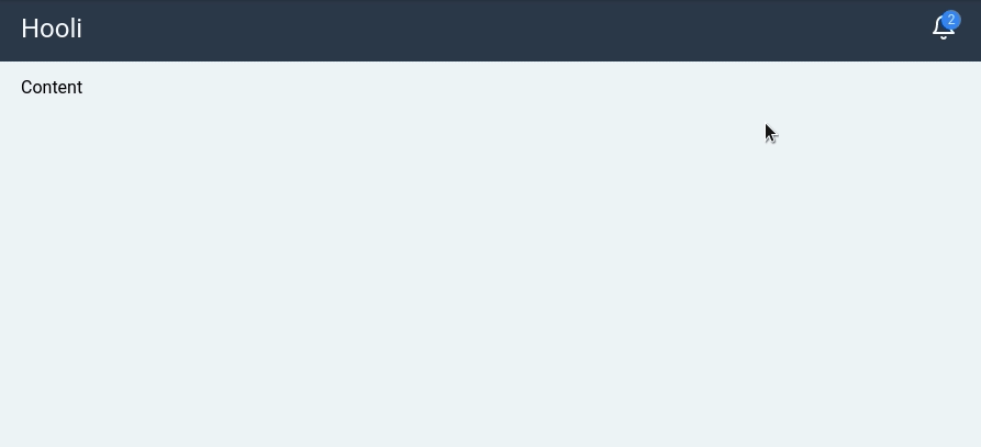
If you now click on the bell button the messages should popup on the screen and toggle every time you click on the bell button.
When the message popup is visible you can also click anywhere on screen to close it. That's the trick with the invisible fullscreen button.
We now have everything in place to start building the actual notification center logic.
Svelte state management#
When people talk about State management in Svelte they often talk about Svelte stores. There are three store types in Svelte.
- Readable - not possible to assign values
- Writable - possible to assign values
- Derived - sub-store derived from other stores
The whole topic on stores is quite big, but the concept itself is quite simple. You can maybe compare them to React's state, but I don't think it would be quite accurate.
I like to view Svelte's stores as global reactive variables.
Below is Svelte's implementation of writable store. As you can see it's written in Typescript and returns an object with three methods: set, update and subscribe.
When you subscribe to a store in your Svelte component, your callback function is added to the list of subscribers. When you set or update a value, it will loop through the list of subscribers and notify each one of them.
export function writable<T>(value: T, start: StartStopNotifier<T> = noop): Writable<T> {
	let stop: Unsubscriber;
	const subscribers: Array<SubscribeInvalidateTuple<T>> = [];

	function set(new_value: T): void {
		if (safe_not_equal(value, new_value)) {
			value = new_value;
			if (stop) { // store is ready
				const run_queue = !subscriber_queue.length;
				for (let i = 0; i < subscribers.length; i += 1) {
					const s = subscribers[i];
					s[1]();
					subscriber_queue.push(s, value);
				}
				if (run_queue) {
					for (let i = 0; i < subscriber_queue.length; i += 2) {
						subscriber_queue[i][0](subscriber_queue[i + 1]);
					}
					subscriber_queue.length = 0;
				}
			}
		}
	}

	function update(fn: Updater<T>): void {
		set(fn(value));
	}

	function subscribe(run: Subscriber<T>, invalidate: Invalidator<T> = noop): Unsubscriber {
		const subscriber: SubscribeInvalidateTuple<T> = [run, invalidate];
		subscribers.push(subscriber);
		if (subscribers.length === 1) {
			stop = start(set) || noop;
		}
		run(value);

		return () => {
			const index = subscribers.indexOf(subscriber);
			if (index !== -1) {
				subscribers.splice(index, 1);
			}
			if (subscribers.length === 0) {
				stop();
				stop = null;
			}
		};
	}

	return { set, update, subscribe };
}
There are, of course, some other internal mechanisms, but the rough idea of managing, updating and notifying subscribers should be straight forward.
Creating the notification store#
Now that we know how what Svelte store is and how it works, let's use one to build our notification store.
We will create a custom store, built on top of Svelte's writable store. That is because we need to expose a few custom methods on it and also hide the direct access to writable's set and update methods.
Let's also write it in Typescript just for the sake of it. I like writing my non-Svelte components in Typescript as it gives me nice autocomplete in the editor and also some type safety.
If you want to learn more how to use Typescript together with Svelte I wrote an extensive tutorial on the subject - How to use Typescript with Svelte.
Before we start writing code we need to think what methods our store needs. Here are some that come to mind.
- init - we want to populate the store with a list of messages on app start
- add - we want to be able to add a new message to the store
- dismiss - we want to mark a message as read
- clear - we want to clear all messages
Now that we have a rough plan let's implement our store. We will use plain strings as messages to keep it simple.
Create an new file called notifications.ts in the src directory and add the following code.
import { writable } from 'svelte/store';

// constructor function
const createStore = () => {
  // initialize internal writable store with empty list
  const { subscribe, set, update } = writable<string[]>([]);

  // mark message as read by removing it from the list
  const dismiss = (message: string) =>
    update(messages => messages.filter(mess => mess !== message));

  // add new message to the top of the list
  const add = (message: string) => update(messages => [message, ...messages]);

  return {
    subscribe,
    add,
    init: set, // alias set method to init
    dismiss,
    clear: () => set([])
  };
};

// initialize the store
const center = createStore();

export { center };
We now have a notification store with five methods. Do you see what we did here? We've hidden the internal writable store inside our own custom store.
The only thing Svelte cares about is that you return an object with a subscribe function, because that function is required for auto-subscriptions to work.
This leads us straight into the next section where we will leverage the feature in our own code.
Using the notification store#
You can remove a lot of boilerplate code by prefixing your store variable name with a dollar sign. The compiler will then generate the subscription code for you on the fly. I personally love this feature.
Here is the code needed to wire up our store in the Messages.svelte component with explaining comments in the right places.
<!-- Messsages.svelte -->
<!-- style tag is omitted -->

<script>
  // import the custom store
  import { center } from './notifications';

  // open-close state
  let show = false;

  const handleDismiss = message => {
    center.dismiss(message);

    // guard to close popup when there are no more messages
    if ($center.length === 0) {
      show = false;
    }
  };

  const handlePopup = () => {
    // don't show popup when no messages
    if ($center.length === 0) {
      show = false;
    } else {
      show = !show;
    }
  };

  const clearAll = () => {
    center.clear();
    // close popup
    show = false;
  };

</script>

<button class="relative p-1" on:click={handlePopup}>
  <svg
    xmlns="http://www.w3.org/2000/svg"
    width="24"
    height="24"
    viewBox="0 0 24 24"
    fill="none"
    stroke="currentColor"
    stroke-width="2"
    stroke-linecap="round"
    stroke-linejoin="round"
    class="w-6 h-6"
  >
    <path d="M18 8A6 6 0 0 0 6 8c0 7-3 9-3 9h18s-3-2-3-9" />
    <path d="M13.73 21a2 2 0 0 1-3.46 0" />
  </svg>

  <!-- show number of messages or hide if zero -->
  {#if $center.length}
    <span class="badge">{$center.length}</span>
  {/if}

</button>

<!-- show only if there are messages -->
{#if show && $center.length}
  <!-- clicking anywhere on the page will close the popup -->
  <button
    tabindex="-1"
    class="fixed inset-0 w-full h-full cursor-default focus:outline-none"
    on:click|preventDefault={() => (show = false)}
  />

  <div
    class="absolute right-0 p-3 mt-1 text-gray-600 bg-white bg-gray-100 rounded shadow-md messages"
	>
    <ul class="space-y-3">
      {#each $center as message}
        <li class="p-3 border rounded">
          <p>{message}</p>
          <div class="mt-1">
            <!-- add dismiss handler -->
            <button
              class="px-2 text-sm text-blue-200 bg-blue-700 rounded-sm"
              on:click={() => handleDismiss(message)}
            >
              dismiss
            </button>
          </div>
        </li>
      {/each}
    </ul>
    <div class="flex justify-end mt-3">
      <!-- add clear all handler -->
      <button
        class="px-2 text-sm text-blue-200 bg-blue-700 rounded-sm"
        on:click={clearAll}
      >
        clear all
      </button>
    </div>
  </div>
{/if}
If you view the app you should not see any badge and when you click the bell button no popup will not be shown, because we haven't added any messages yet.
Svelte's autosubscriptions under the hood#
How does Svelte's autosubscription work? If peek under the hood and look at the generated code we will see this.
function instance($$self, $$props, $$invalidate) {
	let $center;
	validate_store(center, "center");
	component_subscribe($$self, center, $$value => $$invalidate(1, $center = $$value));
	// ...
}
Svelte compiler searches for all variables prefixed with a dollar sign, validates that it's a store by checking for subscribe method and then subscribes to it.
You will also find that Svelte compiler creates custom code blocks where we refer to $center in the code such as if statements and each loops.
Adding new messages#
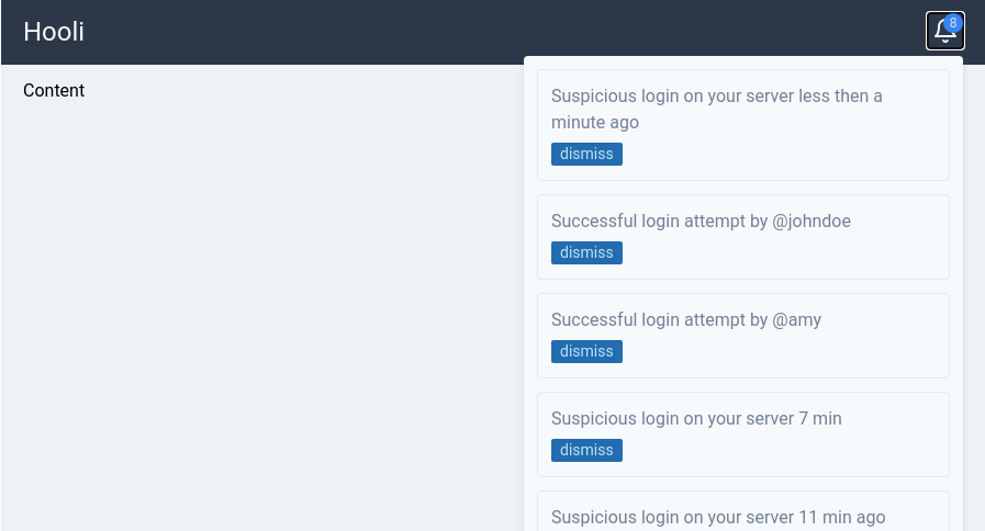
Alright, we have the functionality in place. Let's test-drive our store by adding some messages on app start.
Let's do it straight in App.svelte.
<script>
  import './main.css';
  import Messages from './Messages.svelte';
  import { onMount } from 'svelte';
  import { center } from './notifications';

  // seed out notification store on component mount
  onMount(() => {
    center.init([
      'Suspicious login on your server less then a minute ago',
      'Successful login attempt by @johndoe',
      'Successful login attempt by @amy',
      'Suspicious login on your server 7 min',
      'Suspicious login on your server 11 min ago',
      'Successful login attempt by @horace',
      'Suspicious login on your server 14 min ago',
      'Successful login attempt by @jack'
    ]);
  });
</script>

<div class="container flex flex-col max-w-4xl min-h-screen mx-auto">
  <!-- top menu -->
  <header
    class="flex items-center justify-between px-5 py-3 text-gray-100 bg-gray-800"
  >
    <h1 class="text-2xl">Hooli</h1>
    <nav class="relative">
      <Messages />
    </nav>
  </header>

  <div class="flex-grow px-5 py-3 bg-gray-200">
    <h1>Content</h1>
  </div>

</div>
Now you can see the message count and our messages in the popup. We can also dismiss individual messages and clear them all.
We had to create custom handlers for our actions with guards in them in order to prevent the UI from ending up in the weird state.
But what about if we have many messages to show? Our popup list will be very long in that case.
It's possible to limit the number of messages by using another reactive feature of Svelte - computed variables.
Limiting the number of displayed messages#
<!-- Messages.svelte -->
<script>
  // import our custom store
  import { center } from './notifications';

	// ...

  // limit the number of displayed messages to 5
  export let count = 5;

  // create a list of messages to display
  $: messages = $center.slice(0, count);
</script>

Change the variable reference in the each loop to messages instead of $center

{#each messages as message}
...
{/each}
This way we will always display five latest messages, plus we can override the number of displayed messages if we want to by passing a count variable to Messages component like this <Messages count="3" />.
Pretty neat, right?
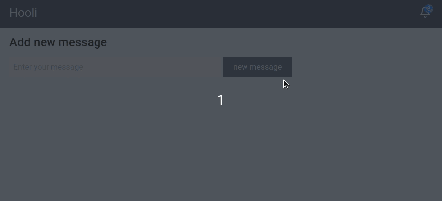
Adding new messages#
Just for the sake of it let's add a form that allows us to enter a new message.
Create a new AddMessage.svelte file in the src directory with the following code.
<!-- AddMessage.svelte -->

<script>
  import { center } from './notifications';

  let value = '';

  const addMessage = () => {
    if (!value) return;

    center.add(value);
    value = '';
  };
</script>

<h2 class="text-2xl font-medium">Add new message</h2>
<form class="mt-3" on:submit|preventDefault={addMessage}>
  <input
    type="text"
    class="w-1/2 p-2"
    bind:value
    class="w-1/2 p-2"
  />
    class="w-1/2 p-2"
</form>
Include it in the App.svelte file.
<script>
  // Main stylesheet. Snowpack will inject it in the head tag
  import './main.css';
  import Messages from './Messages.svelte';
  import { onMount } from 'svelte';
  import { center } from './notifications';
  import AddMessage from './AddMessage.svelte';

  // seed out notification store on component mount
  onMount(() => {
    center.init([
      'Suspicious login on your server less then a minute ago',
      'Successful login attempt by @johndoe',
      'Successful login attempt by @amy',
      'Suspicious login on your server 7 min',
      'Suspicious login on your server 11 min ago',
      'Successful login attempt by @horace',
      'Suspicious login on your server 14 min ago',
      'Successful login attempt by @jack'
    ]);
  });
</script>

<div class="container flex flex-col max-w-4xl min-h-screen mx-auto">
  <!-- top menu -->
  <header
    class="flex items-center justify-between px-5 py-3 text-gray-100 bg-gray-800"
  >
    <h1 class="text-2xl">Hooli</h1>
    <nav class="relative">
      <Messages count="3" />
    </nav>
  </header>

  <div class="flex-grow px-5 py-3 bg-gray-200">
    <AddMessage />
  </div>

</div>
The final result should look like this.
Conclusion#
Svelte's stores is a beautiful concept and they are lightweight too. You can accomplish a lot with little code.
In this tutorial we learned how to create a simple notification center by building our own custom store.
If you want to dive deeper check out this extensive article on how to build your own custom stores.
You can find the full code here https://github.com/codechips/svelte-notification-center
Thank you for reading and hope you found this useful!