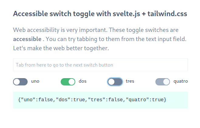
Accessible switch toggle button with Svelte and Tailwind
Learn how to create an accessible switch button in Svelte with the help of Tailwind.css
Sometimes, when working with forms, you might want to style your checkboxes to something more fancy than browser defaults. In this article you will learn how to create a switch button in Svelte with the help of tailwind.css.

For this example we will use my Svelte template which has Tailwind baked into it.
$ npx degit iljoo/svelte-tailwind-parcel-starter svelte-switch
The hardest part of this is to get the CSS right. Fortunately Tailwind makes it very easy. Start of by creating a Switch.svelte file.
<!-- Switch.svelte -->

<style>
  .switch {
    @apply relative inline-block align-middle cursor-pointer select-none bg-transparent;
  }

  .track {
    @apply w-12 h-6 bg-gray-600 rounded-full shadow-inner;
  }

  .thumb {
    @apply transition-all duration-300 ease-in-out absolute top-0 left-0 w-6 h-6 bg-white border-2 border-gray-600 rounded-full;
  }

  input[type='checkbox']:checked ~ .thumb {
    @apply transform translate-x-full border-green-500;
  }

  input[type='checkbox']:checked ~ .track {
    @apply transform transition-colors bg-green-500;
  }

  input[type='checkbox']:disabled ~ .track {
    @apply bg-gray-500;
  }

  input[type='checkbox']:disabled ~ .thumb {
    @apply bg-gray-100 border-gray-500;
  }

  input[type='checkbox']:focus + .track,
  input[type='checkbox']:active + .track {
    @apply shadow-outline;
  }
</style>

<script>
  export let id = '';
  export let text = '';
  export let checked = false;
  export let disabled = false;
</script>

<label for="{id}">
  <div class="switch">
    <input {id} name="{id}" type="checkbox" class="sr-only" {disabled} bind:checked />
    <div class="track"></div>
    <div class="thumb"></div>
  </div>
  <span class="ml-2 cursor-pointer">{text}</span>
</label>
Now, import Switch into the App.svelte.
<!-- App.svelte -->

<script>
  import Switch from './Switch.svelte';

  let uno = false;
  let dos = true;
  let tres = false;
  let quatro = true;

  $: values = { uno, dos, tres, quatro };
</script>

<div class="flex items-center justify-center flex-grow h-screen">
  <div class="max-w-xl">
    <h1 class="text-2xl font-semibold text-gray-700">
      Accessible switch toggle with svelte.js + tailwind.css
    </h1>
    <div class="mt-5">
      <input
        type="text"
        class="w-full p-2 border border-gray-200"
        placeholder="Tab from here to go to the next switch button"
        id="text"
      />
    </div>
    <div class="flex justify-between mt-5">
      <Switch bind:checked="{uno}" id="uno" text="uno" />
      <Switch bind:checked="{dos}" id="dos" text="dos" />
      <Switch bind:checked="{tres}" id="tres" text="tres" />
      <Switch bind:checked="{quatro}" disabled="{true}" id="quatro" text="quatro"/>
    </div>
    <div class="mt-5">
      <pre class="p-4 font-mono bg-teal-100">{JSON.stringify(values)}</pre>
    </div>
  </div>
</div>
That's it. We can now use tab for navigation, to switch between different buttons, and use space to toggle their state. The secret sauce to why it works is Tailwind's sr-only class where checkbox will be hidden, but still be accessible to screen readers. Accessibility is hard to get right, but that doesn't mean we should ignore it.
You can find the code here. Adjust it to fit your needs and as usual, hope that you learned something new. Thanks for reading!